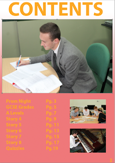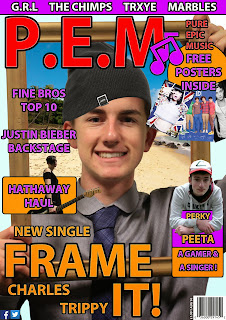

Now however, I believe that my work has improved my so much because I have learned skills through trial and error and research. My Photo editing skills have improved by a lot and I took a lot longer to find the perfect shots of my models to use. I took at least 20 images for each photo that I wanted so that I could pick the best one to work with. I researched a lot into other magazines with similar genres such as Top of the Pops or Smash hits to give me multiple ideas about layout and content for the appropriate audience. Doing this also gave me help with my colour choice to attract the target audience. I have learnt about the layout most I believe because having a pop music magazine appeals more to a younger audience so the font was slightly bigger than other magazines and the front covers looked a lot more bold and colourful and filled with stories that are included in the magazine. I also got the idea to include free posters with my magazine to help sell to the young audience.

Overall, I believe that after getting comfortable with the softwares and programmes and after I had done a lot more research into my style models that my work became a lot more professional looking. This is due to all of the techniques and information I have learnt about my magazine genre, magazines in general and the technology.


No comments:
Post a Comment